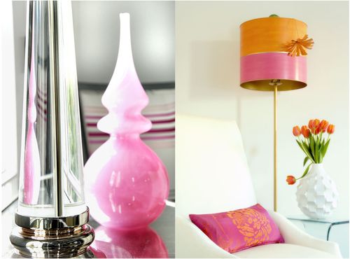
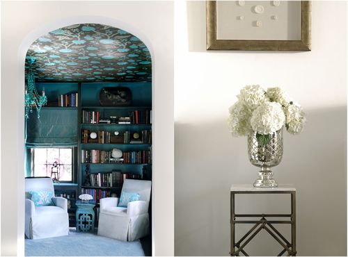
thanks to table tonic, found a bunch of new blogs. most notable was caldwell flake, an interior design company that does a lot of formal rooms but makes them more fun with color. loads and loads of color. behold some of my favorite rooms!

the lamp and the pillow that caught my eye in the photo on the right

obviously the bright wallpaper is quite something – unusual but pretty!
I love the white vase. looks like it was cut out of a book…
almost doesn't look real! but I love it!
pink. pink. pink. guilty as charged. I adore it.
hmm..now if only my initals included "ePc" I could hop into the photo and
grab that pillow. look at the stripes behind the headboard. and the ottoman!
ack! so cute I can hardly stand it.

look up. wallpaper on the ceiling? divine! it is my favorite shade of blue.
I'm a teensy bit color blind. is it blue or green or a bit of both?

loving dots and stripes mixed. I even don't mind the brown walls.
normally I'm all "eh" about brown (that's my highly scientific,
technical opinion…"eh") but it works here!
Leave a comment